ShopDreamUp AI ArtDreamUp


Suggested Deviants


Suggested Collections


You Might Like…


Featured in Groups


Description
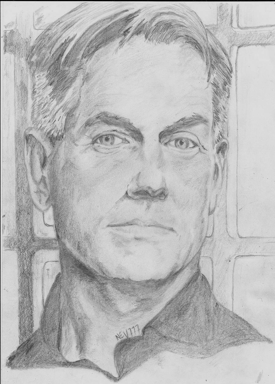
gibbs, so tricky, so angular,so time consuming, so different from what I've attempted before...need more practice. Would appreciate a little feedback where I could have improved this drawing,done on a4 with hb,2b, 4b, f and a lot of patience..(reference pic internet.)
edit : tidied up abit around some of the rougher edges, and darkened shadows.
edit : tidied up abit around some of the rougher edges, and darkened shadows.
Image size
2432x3392px 2.27 MB
© 2012 - 2024 nev777
Comments20
Join the community to add your comment. Already a deviant? Log In
Nev, this is my first critique. I really don't like doing them, because I don't feel I've earned the right to, but since you post such nice comments on my work, I thought I would give it a try. So, here goes. First off, the proportions seem to be perfect, and the reference was a good choice, this piece is one of the best I have seen in your gallery.
The following comments are meant to be constructive, not degrading. Keep your darks dark and your lights light. Only using one color, black, you have to make an impact somehow. You can even exaggerate the spectrum, but be careful not to over due it. I'm not sure how you upload your works, but I have learned if you do not use photoshop or gimp, you can get like a gray wash on you drawings, which would take away from the lights.
The following comments are just tricks and tips I have picked up along the way and really don't pertain to this great drawing. When drawing a picture with a background (other than just white or black) try not using any white or black, but only mid tones, and with no sharp lines (kinda blurring the background). This does 2 things. One, it puts the focal point where you want it, for example Marks face and not the window sill. And two, it gives it a sense of depth. Keep the darkest of the dark and the lightest of the light for the main subject. Although the reference might not show this, artist have the right to improve it!
I hope this was helpful. Please note me with any questions.